Logos / Identities for Luis Rosales (3 separate businesses) 2022
Executive Tax and Popular Title. These LLCs deal with finance— so sleek, professional designs were a must.
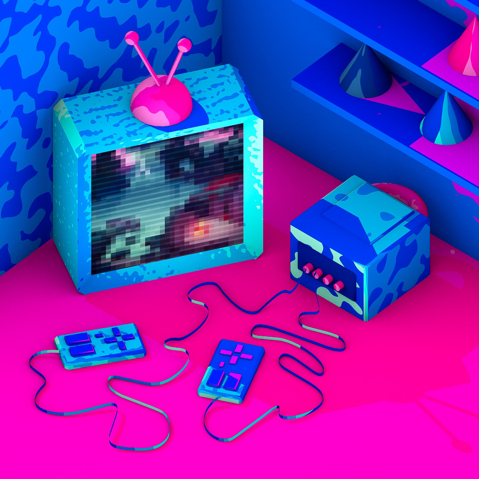
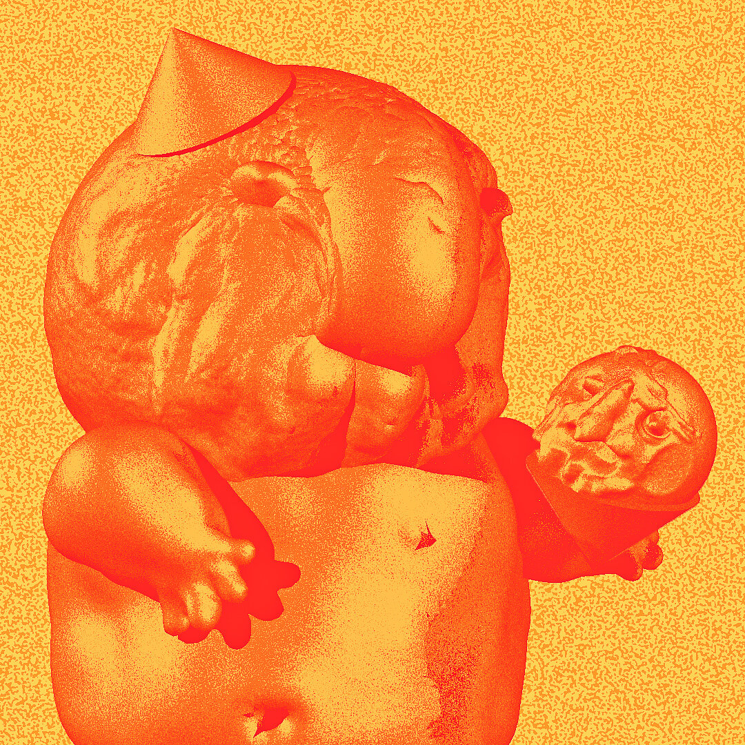
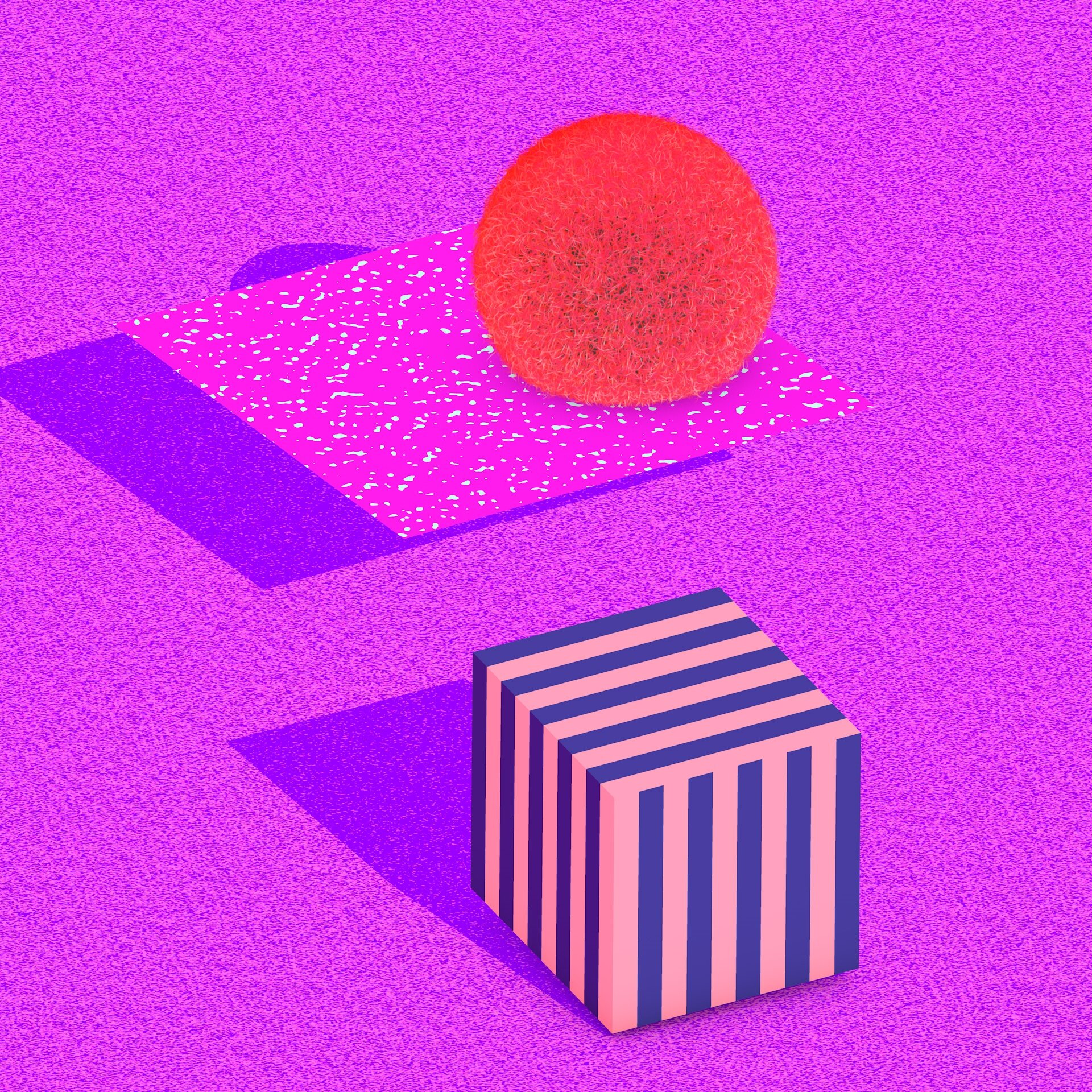
Some colorful Cinema 4D 3D renderings with playful colors and character design.
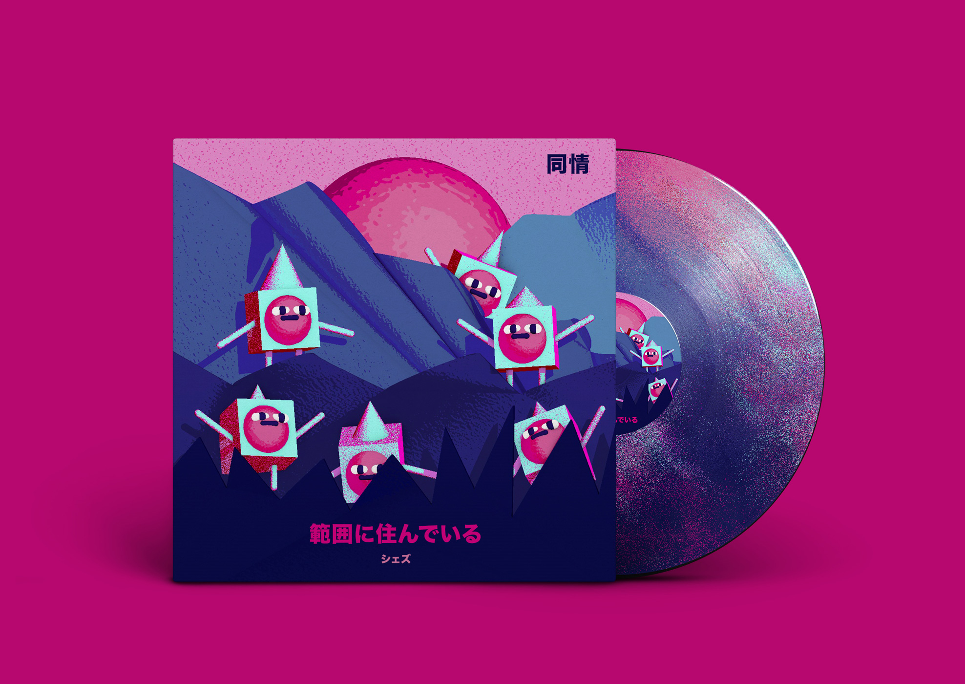

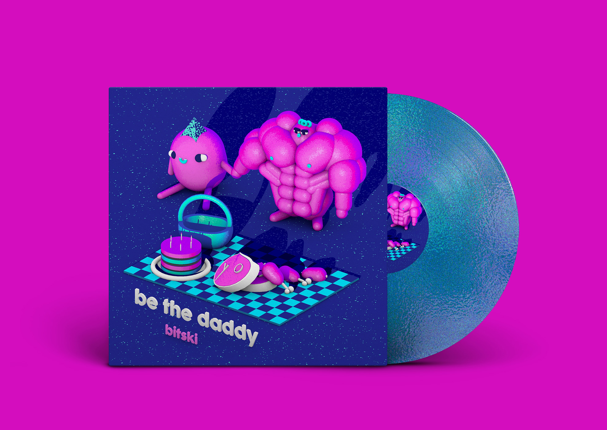

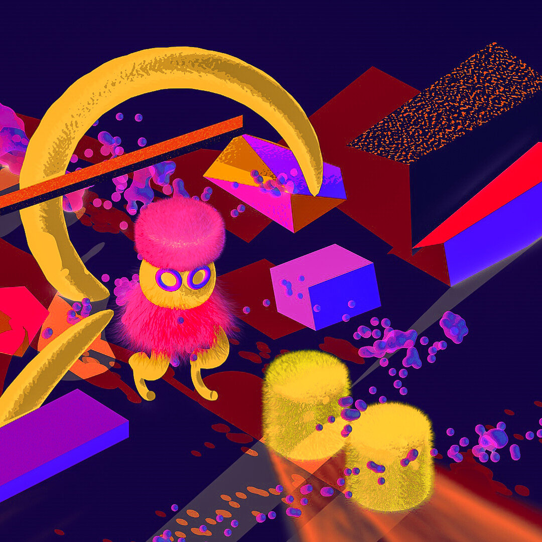

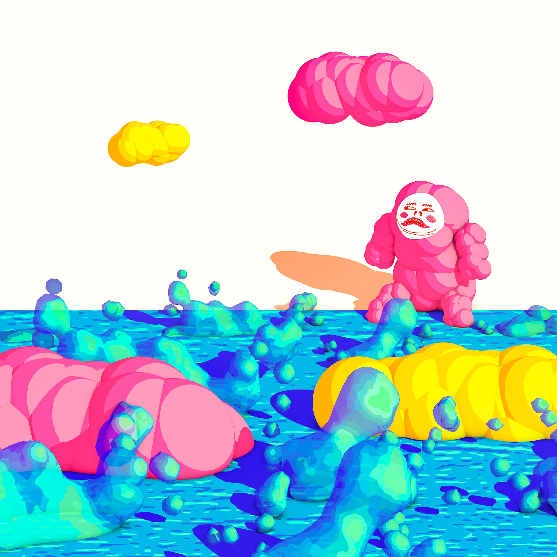

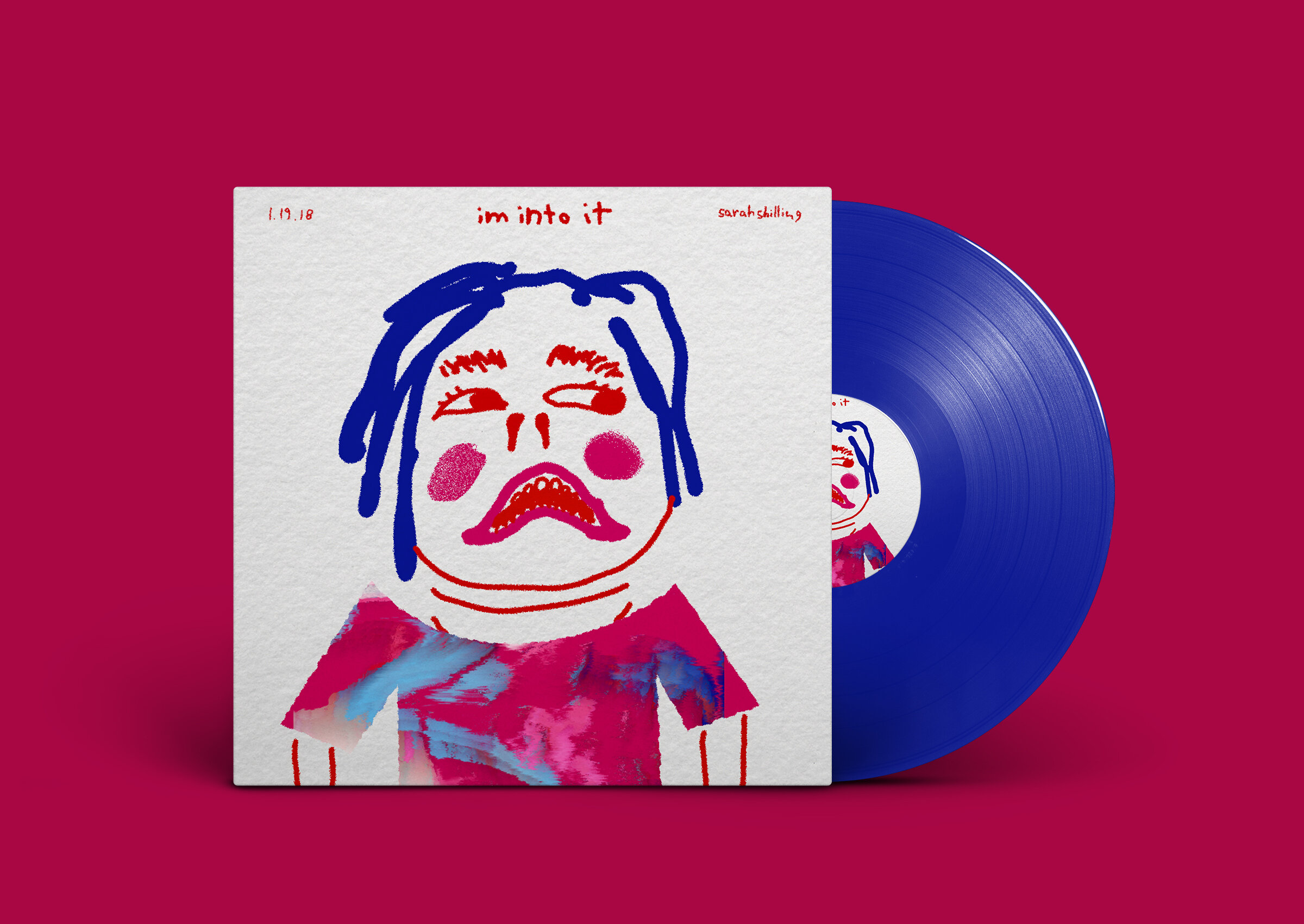
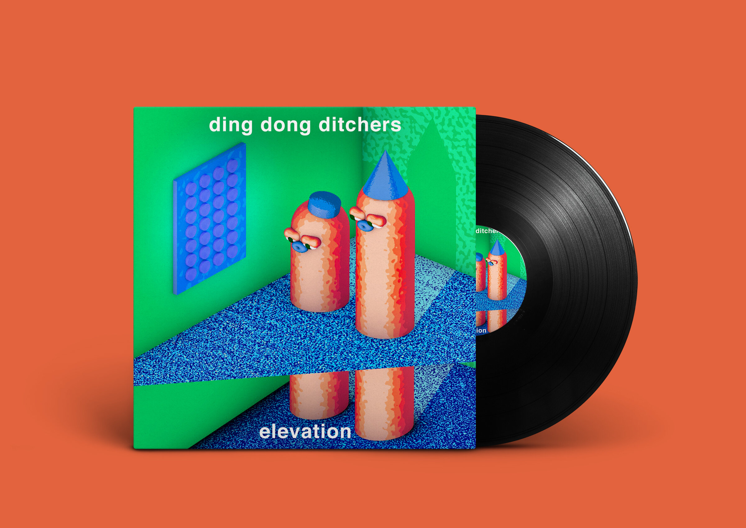
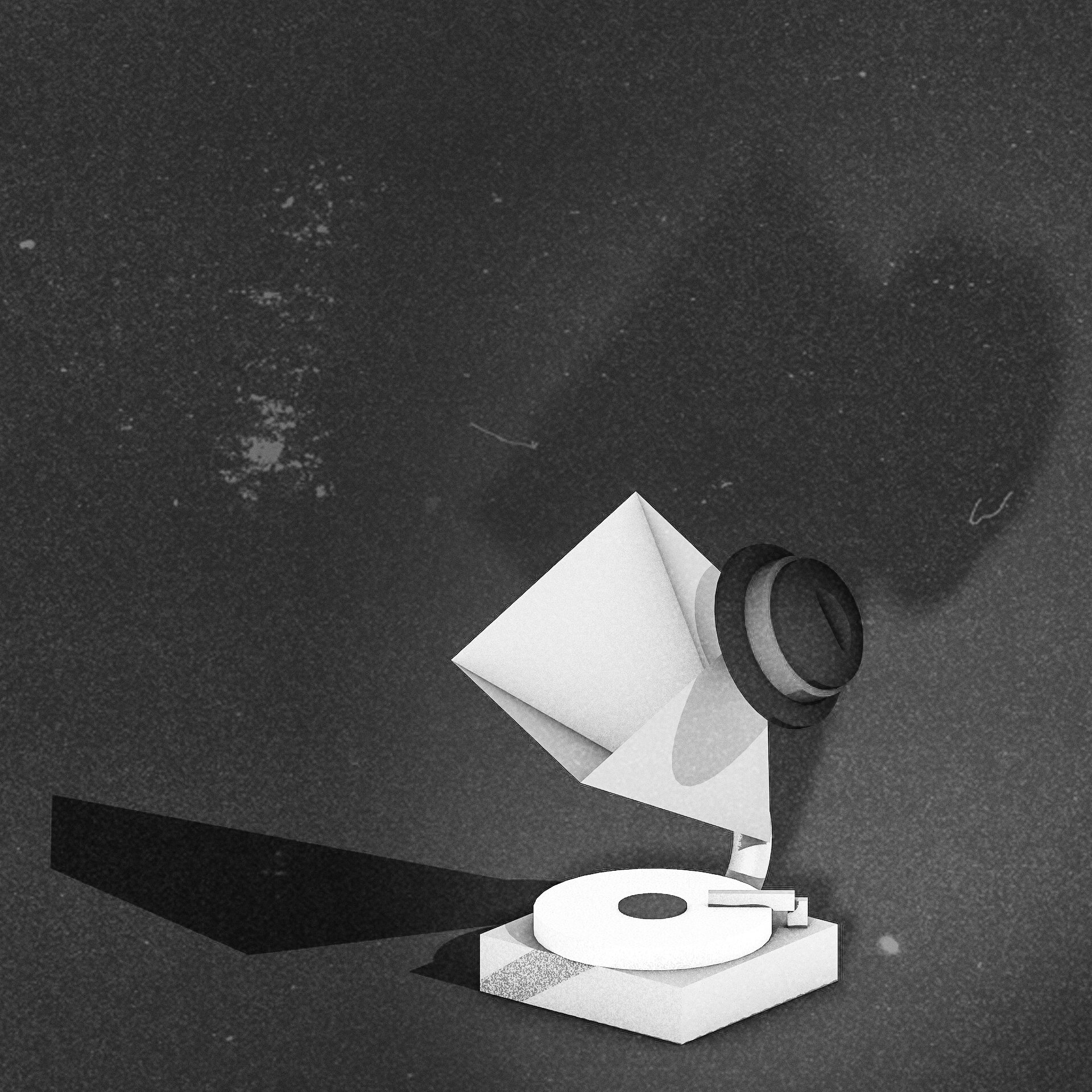
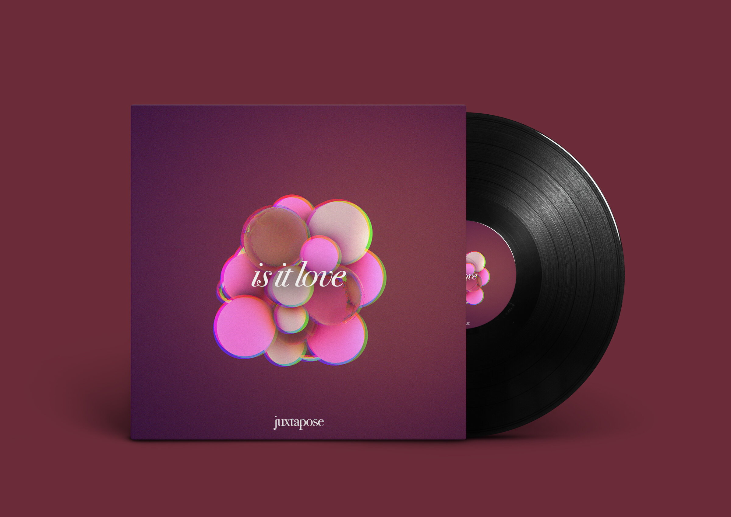
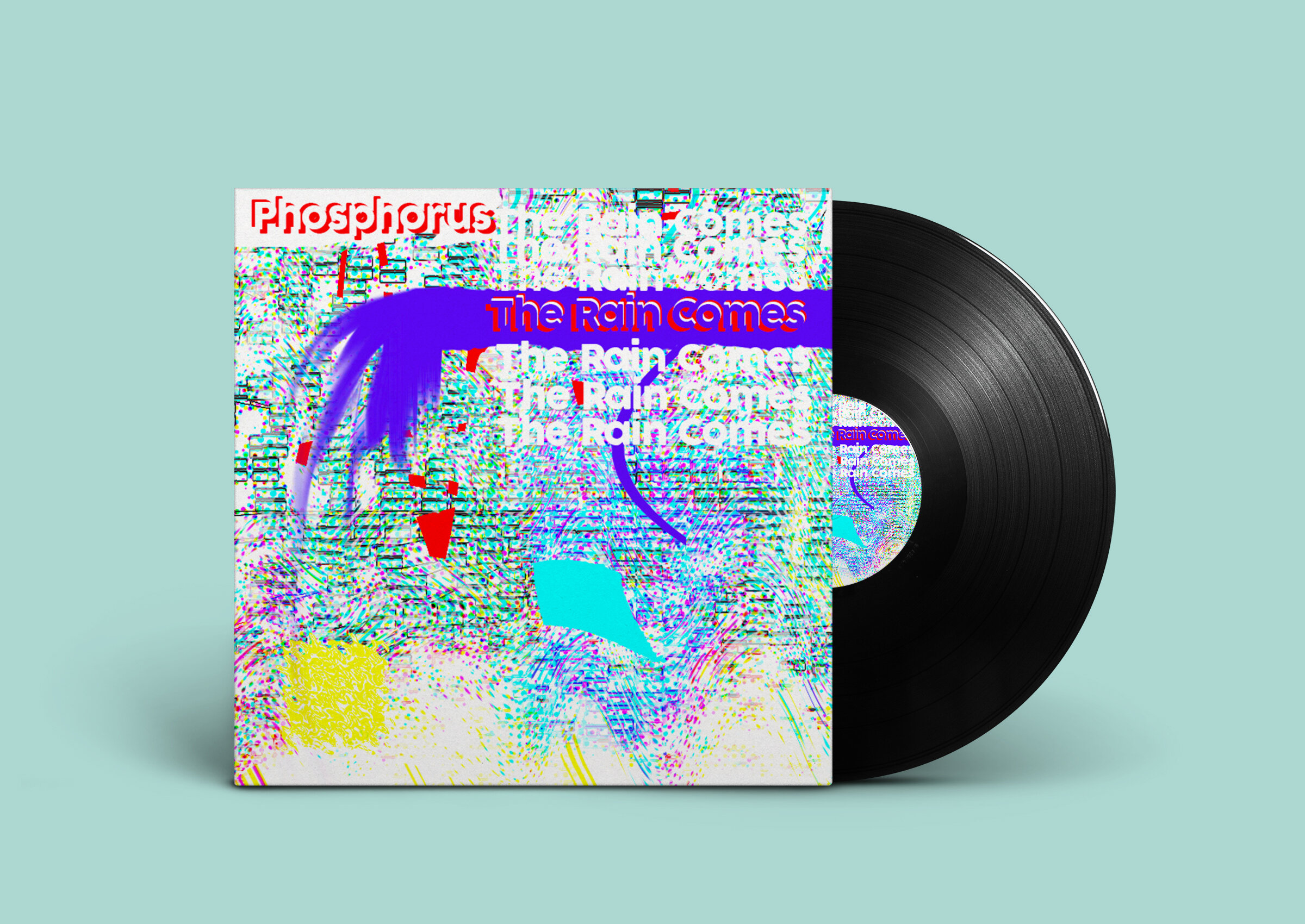
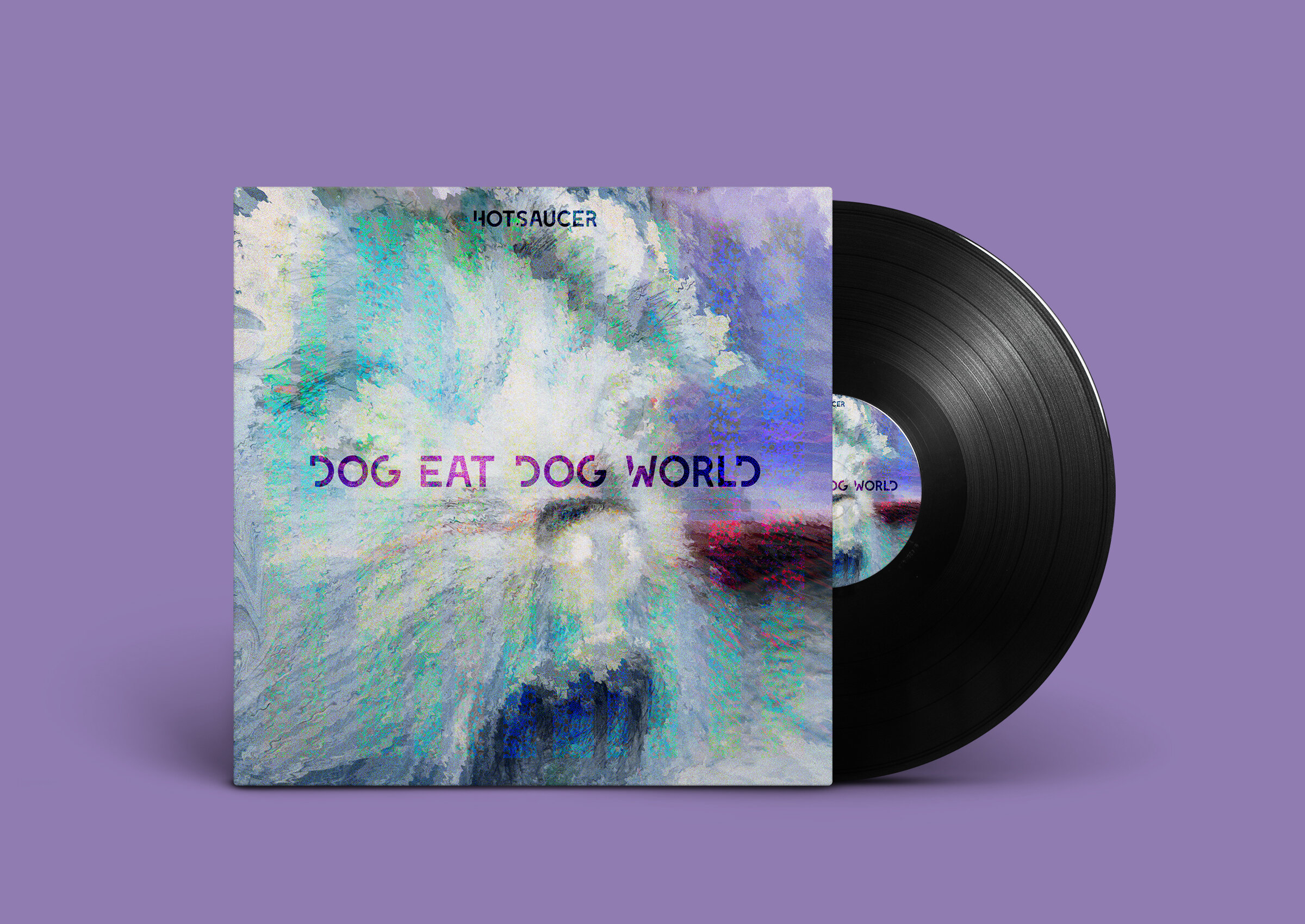

Yeah, I did some shirts and stuff.


Taking photos on a poloroid is an interesting limitation. This is the beginning of me practicing being present by telling myself I can only take a picture when I feel the most alive… or at the very least see something pretty I guess. I only allow myself a handful of photos per year.
Here are 2D/3D digital illustrations of caricatures of friends and family having awkwardness and tension that escalates into an inevitable fight.
Although animation and cartooning have been a large influence in my work through medium and composition, I am mainly inspired by unusual observations within life, such as how people theatrically interact with foods, environment, and each other, turning people into caricatures of themselves to reveal deeper inner-truths. I am drawn to caricature because it is the act of exaggerating or oversimplifying, and how it can simultaneously clarify like a magnifying glass or obscure like a mask. I aim to elevate caricature by not only warping or exaggerating faces, but reflecting on the concept of distortion and miscommunication.
When people see my work, I want them to first have a powerful reaction whether it be laughter or awe, and be interested enough to want to understand why the image was composed, discovering what is beyond the surface themselves, beyond the theatrical, and beyond the caricature.
Digital (Procreate and Blender) - 24" x 18"
Digital (Procreate and Cinema4D) - 24" x 18"
Digital (Procreate) - 24" x 18"
Digital (Procreate) - 24" x 18"
Digital (Procreate) - 24" x 18"
Digital (Procreate) - 24” x 18”
Digital (Procreate) - 18'“ x 24”
Digital (Procreate) - 18" x 24"
Digital (Procreate) - 18” x 24”


Myself and 3 other students created the entire branding of YDSF (Young Designer's Scholarship Fund). This content would be used to inspire the look and design of the scholarship's materials and promotions. My contribution was the idea and drawings of the 'blobs' used as playful illustration and the whole brand using the blob motif. Additionally, all the web mockups and elements are my designs.


The term "gringo" is Spanish slang for someone who is American, or simply not Hispanic or latino.
The video below is the most basic premise of this whole exploration.
My concentration is a dissection and lampoon of my Hispanic heritage through the lens of satire and self-awareness. It is not a celebration of my culture, rather, an analysis of my acceptance and association despite being a sheer opposite to the preconception of the Hispanic. My work is an attempt to translate my insecurity and anxiety of being a Hispanic who can understand, but not speak Spanish.
It is incredibly polarizing to be in a Dominican and Puerto Rican family having been born and brought up in the United States. I have assimilated into a scholarly English speaker bearing the culture and nuances of American culture while Spanish-Americans have stayed stagnant, nearly worshipping the same Spanish language, food, music, etc., at least in my eyes.
Primarily, I use ink and paint in my work, using water to blend and pair the unlike mediums. Ink and print is representational of my cold and calculated side, specifically my love for computation, logic, and wit. The ink builds emphasis on dramatic, chaotic line arrangements displaying tension and structure. Paint and watercolor being symbolic of family, warmth, and Hispanic tradition, topics I am incredibly familiar with but tend to avoid. The paint is more fluid, floaty, and blended into the paper through layers of washes of acrylic and watercolor.
Water is the binding force between these opposites, like how I'm trying to bind my logical side with a more compassionate approach in my life. The vibrant convention of paint and the monochromatic dissimilarity of ink coalesce to form a contradictory tone and feeling based on the viewer's perception. For instance, you may laugh at a banana in an unexpected environment, then learn that I represent the banana, reflecting my difficult inner dissociation from my family and heritage.
I perceive art as an entertainment, humor and absurdity being the vehicle in which I can create a bridge of relatability with the viewer. There is a large emphasis in visual and conceptual puns to create irony through symbolism and the duality of opposite interpretations. I require an instant reaction, the reaction I crave but starve of when interacting with family and relatives.
I use unexpected imagery, grotesque subjects, and exaggerated scale to show unusual scenes that may be intensely chaotic, other times intimately melancholic. My drastic switches between emotions parallels my feelings during its creation. Sometimes I was deeply saddened that I struggle with genuinely connecting with my culture, other times I was very self-aware that my problems may be unimportant and that I am only creating the problem myself, and that I am only comically exaggerating what is actually occurring.
There is something humorous yet melancholy about not being able to speak a word of Spanish, yet I am unquestionably embraced by love and sense of community. I am not sociable and eccentric like the common Hispanic, yet I look the part, so that must be my identity.
Acrylic on Cardboard - 24” x 16”
Acrylic on Newspaper - 24” x 18”
Acrylic on Canvas 16” x 16”
Watercolor and Ink on Paper - 16” x 16”
Acrylic, Watercolor, and Ink on Paper - 14” x 14”
Watercolor and ink on Paper - 6” x 9”
Mixed Media on Paper
Watercolor, Newspaper, and Ink on Paper
Acrylic and Ink on Newspaper - 24” x 36”
Acrylic, Ink, Watercolor and Color Pencil on Canvas and Paper


A collection of all my sketchbook scans. I wrote ALOT of concepts, as opposed to thumbnails or sketching, for each painting. Perhaps because I was also taking Art History and was very interested in adding a buncha symbolism. The interpretation of my paintings isn't very clear with just the image; these pages explain way more if you care to delve in.


This is a video basically recording the process of making the picture, skipped to 3:28, but feel free to watch the entire video as it is beautifully disgusting.
A series of anti-fashion editorials, one using a monochromatic blue color palette with puppetry ("Who Could Be Calling At This Hour?") and another that satirizes the value of consumer objects and how we choose to advertise them (Serious Consumerism).
Do I even need to explain the other one? Go watch Snow White. (“Does This Make Me Look Fat?”)
Spreads of a book drawing parallels between silliness and seriousness. The writing combines work from a philosopher (Alan Watts) and a standup comedian (Louis C.K. …[edit] before his fall from grace…), while the imagery combines two graphic designers with unlike styles consisting of illustration and paper-cut techniques. I wanted to show how two seemingly unlike things can seamlessly work together to create something new. The cover of the book is parody of the New Yorker's Eustace Tilley, as the publication embodies the idea of 'silly sophistication' in my opinion.


A collage using a 60" x 30" canvas, acrylic, huge prints, and ink. Basically about nihilism and societal apathy.

A soda bottle label design combining 2D, 3D, and photographic elements.

Several posters created for school events.

The poster that would be used to promote one of their scholarship events Bridging The Gap. My design was created in Photoshop for layout and Cinema4D for imagery.
In 2016, Locust Projects presented the 7th year of LAB (Locust Arts Builders). 22 student artists and I were were selected from an open call and had the opportunity to create a collaborative exhibition at Locust Projects in Miami’s Design District.
Under the direction of Miami-based contemporary visual artists Monica Lopez de Victoria (of the TM Sisters) and Francesco Lo Castro, we created a collaborative exhibition and managed all aspects of the show’s production. We also visited art institutions on field trips and interacted with invited members of the local art community at Locust Projects during the three-week summer intensive. The exhibition concept was our collective and conflicting experiences with the advancement of technology and communication.
The LAB program extends Locust Projects’ longstanding commitment to experimentation and innovation in artistic practice to the next generation of South Florida artists. LAB promotes contemporary art and project-based learning as a means to encourage creativity, critical analysis, and problem solving, while also helping participants to develop their communication skills. This unique initiative allows young artists to learn the practical aspects and experience the excitement of creating a public exhibition in collaboration with their peers.
I helped others in the making of their sections, but my main contribution was the pixelated hole-in-the-wall with tape subsections and a projected animation.
I made a loop of driving through Miami to be played and projected on top of the pink inflatable during the exhibition. Max Furster created the music in the video.


I attended School of Visual Arts's Precollege program in New York and created a 10 page comic in just 3 weeks. It's about Da Vinci creating a machine-learning robot that was created to help him complete simple tasks, but eventually is capable of replacing him.
10 cards that parody famous graphic design imagery.


